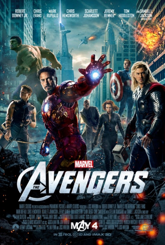
At the front of the poster stands Iron Man. He is the first person that the viewer would see in the poster, as it would generally be seen left to right, and the biggest character jumps off the poster first. His extended arm gives the poster a 3D feel to it and seems to almost be reaching out towards the viewer, dragging them into the poster. Iron Man is effectively used to pull in the audience, as seen through this pose. He was probably chosen as Robert Downey Jr is arguably one of the most well known leading characters in the film. Samuel L Jackson is probably equally well known, but his character doesn't look as dramatic as Robert Downey Jr's and he also doesn't play as big a role in the film. Following this Iron Man was the obvious choice to be at the helm of the poster.
To the right of Iron Man is the second most obvious character in the poster - Thor. Thor occupies an important area of the poster, as he seems to almost bookend it and stop the viewer looking any further to the right. His pose almost seems to be stopping the viewer looking away or any further in that direction and holds their gaze on the poster. The actor, Chris Hemsworth, also has a significant following of young ladies who think that he is very good-looking, so he would also draw in a female audience. He also draws the attention of the audience because, after Iron Man, he is probably the most impressive looking of the characters. Captain America could not be put here because he does not appeal so much to an international audience and the Hulk is too big. Thor therefore seems the obvious choice, and after Iron Man has drawn the audience in, Thor holds their gaze and also bounces their gaze back into the poster by occupying the space to the far left of the poster.
Hulk was probably a lot more difficult to place in the poster. The producers would want him to be noticeable as he is an iconic character and would draw in a large fanbase. He is also a very impressive looking character that could draw attention to the poster. The problem is that he is a very large character, and if he were placed at the front of the poster then all the other characters would have to be very small to allow for the proportions to be correct. To overcome this he is put in the top right corner of the poster and looks as though he is preparing for a fight. His ready-for-action pose draws the viewers attention, and it makes the film look action-packed and exciting, as though the characters were constantly on the move. His placement in the poster is made easier by the decision to put the characters in a city that is under attack. This means that Hulk does not look out of place by being ready for action, but the poster looks almost as if it were taken straight from the movie.
Below the Hulk is Hawkeye, who seems to bookend the left hand side of the poster. He too seems ready for action and again makes the film look exciting and action packed. His pose also suggests that there are some sort of antagonistic forces at work outside the poster, giving it a 3D element. It makes the poster seem to come to live a lot more. Below Iron Man's arm are Nick Fury and Black Widow. Black Widow is the only character that seems to be moving forward, so her pose adds more action to the poster and makes it seem less static. Nick Fury is very cleverly slotted in behind her, but looking around her. Despite the lack of space for his character, the pose manages to fit around it perfectly; fitting underneath Iron Man's arm and around Black Widow. Last of all is Captain America who is neatly standing on a piece of rubble that elevates him to a height that he can be seen from. Using the location to get around the difficulty of fitting him in is a stroke of genius, and it is very well pulled off.
Behind all of this is New York City, distinguishable through the iconic Empire State Building. There are some sort of spaceships in the background and some of the buildings are blowing up. This allows the poster to hint at elements of the storyline - establishing that the film is about a fight that takes place in New York. The background stops the poster becoming just about characters and points to an even bigger storyline. It keeps the poster alive and full of action, which is exactly what the target audience wants to see.
No comments:
Post a Comment