Friday, 4 October 2013

The Dark Knight Rises Empire magazine


The Dark Knight


With this being the third film in the Dark Knight Trilogy the character batman is a very distinctive feature on the front of the magazine. Recognisable from the previous two films and comicbooks alike. This helps the audience to immediately identify the film, even without looking at the title of the film.

The pose shows batman with some sort of gun/sci fi based weapon though those who know the batman from the previous films would know that he does not kill. This image intrigues the serious fans though also brings up questions for those who don't know a lot about the batman but still like films with him in.. Batman has a huge fan base and anyone that did not know the genre of the film, or what the film is about are few and far between, even those that are not huge fans of the franchise still know who Batman is and what he does. If for some reason a member of the audience did not know what batman is or what genre the film is, the large weapon over Batman's right shoulder is sure to make them realize that this is an action film.

The main character in the image, Batman, is wearing the standard batman outfit and mask, this is not surprise as its the most iconic thing about batman. The plain black background is not common with most Empire magazine covers and would prove hard to be able to see the Batman, however the use of a light from behind the batman is interesting allowing us

The title of the film is in white, which makes it very visible to the audience and makes it stand out from the rest of the image. The positioning of the name of the film however is alot different that that from alot of other Empire covers. This one is located in the bottom left of the cover, but most of the titles on the empire covers are located close to the middle on the vertical center line. This does have an impact on the cover as the title is not as in-your-face as the other where it is located in the middle of the page, but that does not mean that the title is not visible to the audience, because it is. The font used is the same as that used for most of the Empire covers and is similar to the font used in the Empire title at the top of the page. This helps to keep the page looking clean and appealing.

Other than the main image and title, there is not really much else in on the cover of the magazine, this helps to attract the audicnes attention to the main image and the main name of the film, which is what you want if you are advertising a film.

Monday, 30 September 2013

poster idea's

I came up with a idea for a poster which i was very dissappointed when i found out that in fact it is a design by Olly Moss. his style of abstract posters is something i would very much like to do. We shall be creating two posters one a abstract and one a normal film poster.
Here are some of Olly Moss' designs:


These are not conventional posters as seen by my analysis' throughout this month. The idea of using a more artistic poster is a good idea however is not a viable one with a film that does not have sufficient funding to be able to advertise through means of television etc.

Sunday, 29 September 2013

Now you see me poster analysis


The Now You See Me poster shows the cast of the film walking threw what looks like mirrors that form the name of the film. The cast are not fully shown as some of them disappear behind the gaps between each letter while others don't. This gives the audience the feeling that this film is about illusion, this follows the name of the film as it is a known saying used my magicians when they do their famous disappearing trick.
The poster allows the audience to see some of the actors that are going to feature within the film. This gives them something else to look for when looking for films that they want to go to watch, as some people aren't fans of the films but mainly the actors that are within the film, for instance fan of Michael Caine would see that he is going to be one of the key characters within this film and so they will want to go and see what he brings to the film as every actor brings something different.

This poster does not give a lot of information about the film other than the names of the people that have had something to do with it and the name of the film. When it comes to when the film comes out the poster simply says 'Coming Soon' this will then allow people to go and find their own information about the film if it is truly something that they are going to be interested in watching, and by doing so it will allow them to look up the trailers for the film to see what the film is actually going to look like.

Saturday, 28 September 2013

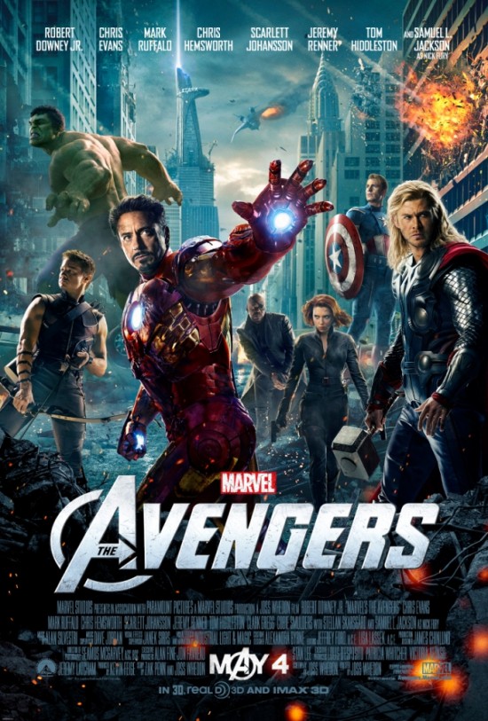
poster analysis the avengers

 http://micechat.com/wp-content/uploads/2013/03/the-avengers-poster.jpg
When faces with this scenario, most films opt for the classic approach of putting one characters' head on top of another in a sort of human pyramid, as with the 'Lord of the Rings' and 'Star Wars' posters. However these often leave no room to hint at the plot and just end up being a bundle of heads without much else. Contrariwise, this poster displays a large cast and still manages to include a lot going on in the background. The arrangement of the characters is also different from the usual approach as they are spread out more and size is played around with. If the placement of each character is examined carefully, then this could be applied to my own work.

At the front of the poster stands Iron Man. He is the first person that the viewer would see in the poster, as it would generally be seen left to right, and the biggest character jumps off the poster first. His extended arm gives the poster a 3D feel to it and seems to almost be reaching out towards the viewer, dragging them into the poster. Iron Man is effectively used to pull in the audience, as seen through this pose. He was probably chosen as Robert Downey Jr is arguably one of the most well known leading characters in the film. Samuel L Jackson is probably equally well known, but his character doesn't look as dramatic as Robert Downey Jr's and he also doesn't play as big a role in the film. Following this Iron Man was the obvious choice to be at the helm of the poster.

To the right of Iron Man is the second most obvious character in the poster - Thor. Thor occupies an important area of the poster, as he seems to almost bookend it and stop the viewer looking any further to the right. His pose almost seems to be stopping the viewer looking away or any further in that direction and holds their gaze on the poster. The actor, Chris Hemsworth, also has a significant following of young ladies who think that he is very good-looking, so he would also draw in a female audience. He also draws the attention of the audience because, after Iron Man, he is probably the most impressive looking of the characters. Captain America could not be put here because he does not appeal so much to an international audience and the Hulk is too big. Thor therefore seems the obvious choice, and after Iron Man has drawn the audience in, Thor holds their gaze and also bounces their gaze back into the poster by occupying the space to the far left of the poster.

Hulk was probably a lot more difficult to place in the poster. The producers would want him to be noticeable as he is an iconic character and would draw in a large fanbase. He is also a very impressive looking character that could draw attention to the poster. The problem is that he is a very large character, and if he were placed at the front of the poster then all the other characters would have to be very small to allow for the proportions to be correct. To overcome this he is put in the top right corner of the poster and looks as though he is preparing for a fight. His ready-for-action pose draws the viewers attention, and it makes the film look action-packed and exciting, as though the characters were constantly on the move. His placement in the poster is made easier by the decision to put the characters in a city that is under attack. This means that Hulk does not look out of place by being ready for action, but the poster looks almost as if it were taken straight from the movie.

Below the Hulk is Hawkeye, who seems to bookend the left hand side of the poster. He too seems ready for action and again makes the film look exciting and action packed. His pose also suggests that there are some sort of antagonistic forces at work outside the poster, giving it a 3D element. It makes the poster seem to come to live a lot more. Below Iron Man's arm are Nick Fury and Black Widow. Black Widow is the only character that seems to be moving forward, so her pose adds more action to the poster and makes it seem less static. Nick Fury is very cleverly slotted in behind her, but looking around her. Despite the lack of space for his character, the pose manages to fit around it perfectly; fitting underneath Iron Man's arm and around Black Widow. Last of all is Captain America who is neatly standing on a piece of rubble that elevates him to a height that he can be seen from. Using the location to get around the difficulty of fitting him in is a stroke of genius, and it is very well pulled off.

Behind all of this is New York City, distinguishable through the iconic Empire State Building. There are some sort of spaceships in the background and some of the buildings are blowing up. This allows the poster to hint at elements of the storyline - establishing that the film is about a fight that takes place in New York. The background stops the poster becoming just about characters and points to an even bigger storyline. It keeps the poster alive and full of action, which is exactly what the target audience wants to see.

Sunday, 22 September 2013

Mission Impossible 4 Magazine analysis


Empire Magazine: #270 (December 2011)

Mission Impossible 4


The cover of this edition of empire magazine showcases Tom Cruise Paula Patton, Simon Pegg and Jeremy Renner feature in the background of the image. These actors play the main characters of the film and most of them have appeared in the previous films at some point. Featuring the main characters in the front cover of the magazine helps to atteract the audicnes attention as the characters, especially Tom Cruise have a huge fan base and by putting him on the front cover, they are appealing to an audience that includes fans of action films, spy films, sci-fi films and fans of Tom Cruise.

The genre is a bit harder to identify from the offset in this cover image as some of the other civer images i have seen, there is nothing really that gives away the genre, other that the title, but for those that are not familiar with the Mission Impossible franchise, it might be a little tricky for them to identify the genre of the film that they are advertising, but there are a few hints in the image as to what the genre could be.

The characters are all wearing black with Ethan wearing the iconic black leather jacket. This could be something that could help the audience identify the genre as well as the futuristic background. It is a very dark image overall with very few objects in the background. The rest of the characters as well are wearing darker clothes, mostly black with also helps to give the image a darker and more mysterious feeling, even though the genre of the film is an action film, but the mysterious feeling of the image makes it more interesting to the viewer, as well as helps the advertising of the film.

The title of the film is shown in white text in almost the center of the page, which is the second thing that the audience audience will see after the main image in the center of the page, The white text makes the title pop out of the page, especially against the white background, the white text also makes the page look really clean, which makes it more appealing to the audience. The font of the title is similar to the Empire title at the top of the page, this keeps the page tidy and appealing to the eye.

Thursday, 19 September 2013

Mirrors - Poster

Mirrors - Poster


How can we tell that this film is a horror?
There are different things within this image that allow us to understand that the film is of horror genre, one of which being that fact that at the bottom of the poster, left hand side, the text reads 'THERE IS EVIL' this is a big hint to the audience that the film is horror. Another key element that informs the audience of the genre would be the worried look upon the woman's face, she looks scared and worried. This lets the audience know that this film is going to have an effect on this family. Another aspect that adds to the horror feel of the film would be from using all the characters on the poster looking at the same position leading the audiences eye away from the majority of the poster, this then leaves the audience asking questions, and from assistance from the title of the film they know that what the people fear isn't whats under the water but whats can be seen on it.

USP?
Horror films seem to use the idea of fearing what you can't see, but this film gives the opposite idea, the use of mirrors intends for the audience to fear what they can see for some things are never what they seem. Something as harmless as a reflection could be the cause of a persons demise.
When you look at film posters they normally list all of the actors that you can see on the poster, but this one does not, it simply focuses you attention to the main character Kiefer Sutherland. This allows the viewer to understand that this film is going to have a huge impact and influence upon this character. But why would they include the other two in the poster if they wanted your attention to be focused on Kiefer? Because they want you to be able to know that what ever happens in the film is going to effect him but we now get the idea that it is going to be in the indirect way of threw his family. This is making people start to relate to the character already for the targeted audience are going to understand what it is like to have a family that they love and care about. This manes that when the family on screen becomes threatened they emphasise for the character because they begin to put themselves into that situation.
The poster uses the motto of 'THERE IS EVIL ON THE OTHER SIDE' when we this of 'the other side' the most common idea would be death, heaven, after life or anything of that general idea. But this film poster pushes you to think beyond that because there are many different kinds of other sides that are in our every day lives that could still be just as fearful and deadly as the dead.

Colour?
This poster uses a Low Key light to give the poster a more ominous look to it. Making the audience feel venerable, for nothing makes a person feel more venerable than knowing that something is there, but not being able to see it. Horror film play off the idea of being afraid of the dark, but they use the logical understanding that people aren't afraid of the dark, they are afraid of whats in the dark (Afraid of the unknown). Horrors remind us of the things that can happen when we're not looking and that is what makes people scared, the idea that what they see on the screen could be happening, they just wouldn't know it. When watching a horror film the scenes which seem to have the most tension is when the main character is facing away from the danger that is approaching them, because we can see this figure walking up behind them, we know what is going to happen, but the character does not. This is all played with when posters use Low Key lighting, films that use Low Key want to induce either fear, mystery, suspense, danger, ect.
The mirrors poster uses both High and Low Key lighting, the High Key is where the family are together adding the idea that they are safe, but the Low Key is used under their feet and around them, making the audience get the idea that there is no escape, they are surrounded. Allowing the audience to feel even more danger.

Convection of Posters?
Poster are just another way of advertising a film or product. They want to be able to catch the eye of people in the street and begin to set up questions. The main drive that is going to make people want to watch a film is to answer the question that they have begun to ask in their head. Even if it is simply a question like 'I like that actor, I wonder how they are going to effect the film' even a question as simple as that will begin to make this observer want to watch the film.

Skyfall poster

 Skyfall


The Skyfall poster starts off grabbing the attention of the audience by showing them this vingate image of James Bond leaning against his classic Astin Martin car with Big Ben in the background.
The vintage colour allows the audience to get that feeling of old, this would be because the James Bond films have been around for such a long time, but they still keep delivering the same amount of astonishing content as they did when they first started. But because of the black and white colour of the poster it makes the 007 which is in a gold/bronze colour stand out. Although they chose to have the 007 smaller than the rest of the text, they still wanted the audience to be able to take note of it as some people may not know that this film is apart of the James Bond franchise. By making 007 stand out in some way it allows the audiences eye to be drawn to it.
USP? Skyfall uses the USP of being apart of the James Bond franchise, as this now reaches out to the fans of the James Bond series. Not to mention that James Bond is one of the most world wide known secret agent franchise going. This means that it is going to have a wide spread over the world. Another aspect of the film that would make it stand out to the audience would be the actor, Daniel Craig was also the man who played James Bond in Casino Royal and Quantum of Solace. This also means that it is easier for the audience as they are already sue to seeing him as the role of James Bond and so they won't have to get use to seeing another face as that iconic character. Another aspect of using Daniel Craig is that he has been known for his role in other atcion films such as Cowboys and Aliens and his roles in adventure films such as Lara Croft: Tomb Rader. This places him as an actor that is going to bring people into see the film as people may not be a fan of the James Bond franchise but are a fan of Daniel, but if that is so then you would probably already have seen the other James Bond films that he has been in and are already planning in seeing this one.
The poster also allows the audience know that the film is going to be avalable to watch in IMAX, this means that the visual and audieo quality are going to a spectacle themselves, meaning this is going to rech to the audience of film lovers that want to see what the film makers have been able to do with the film, they may not be there because they love the franchise, but they want to see the visual magic that is going to happen on the screen.
Looking closer at the poster you notice that James Bond is folding a gun in his right hand. This lets the audience know that there is going to be a high aspect of danger within the film, but of corse it would be a James Bond film without a number of chase/gun fight scenes, and what action film lover won't want to see a film that is going to be using both of them.